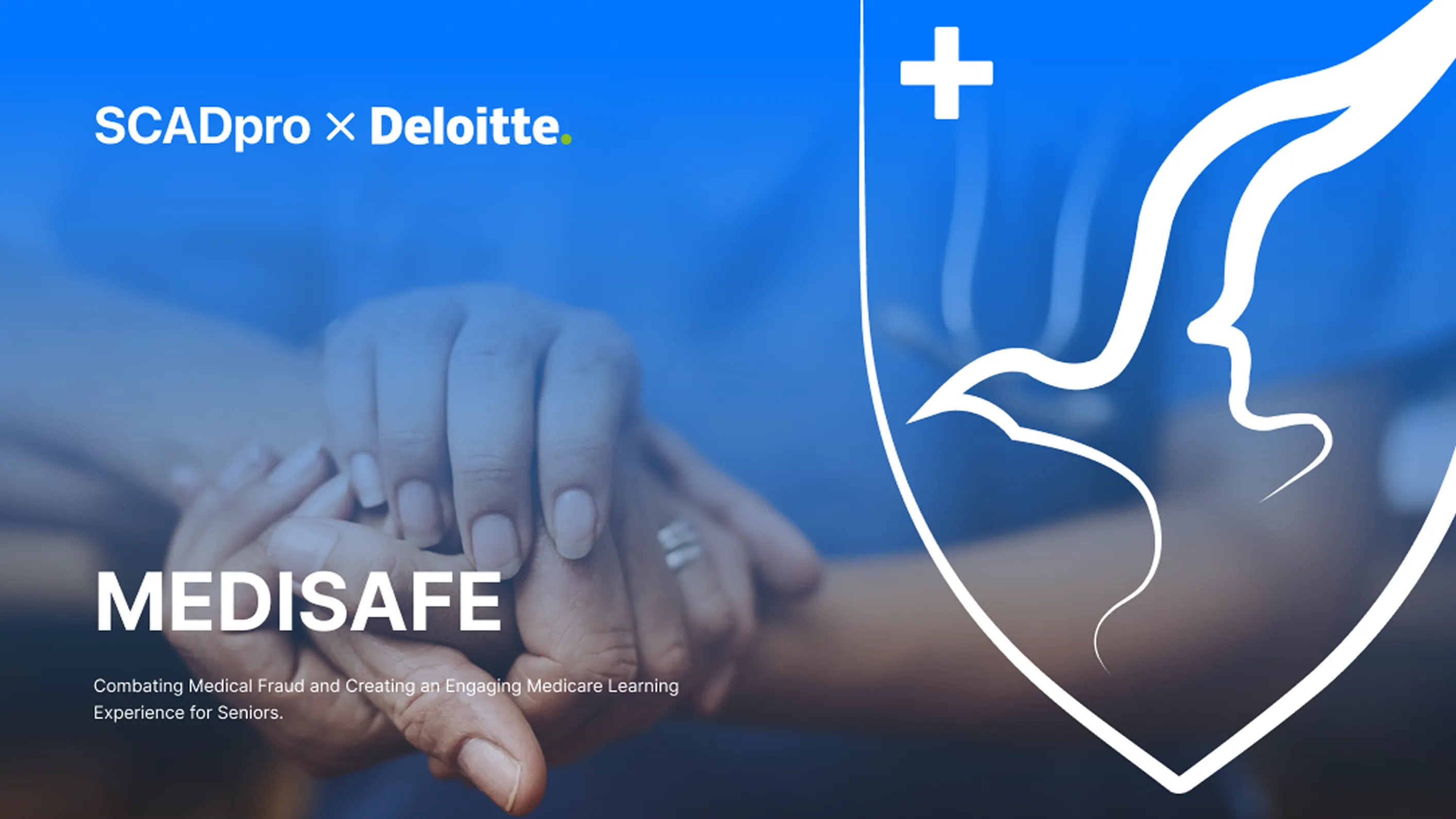
Medisafe: Making Medicare Fraud Legible Medisafe:让 Medicare 欺诈可被看懂
A mobile service that helps seniors and caregivers recognize suspicious Medicare charges, verify them quickly, and report fraud with less friction. Built in a ten-week SCADpro partnership with Deloitte, using 100+ field research insights. 一款面向美国 Medicare 场景的移动端服务,帮助老年人和照护者看懂可疑账单、快速核实并上报欺诈。项目来自 SCADpro 与德勤的十周合作,基于 100+ 条田野研究洞察。
Medicare fraud costs the U.S. an estimated $60B a year, yet the people most targeted often have the least support for spotting it. Seniors receive coded statements they do not read closely. Caregivers manage bills but may not know what counts as fraud. Reporting channels are slow enough that many people abandon the process. Medisafe explores how a mobile tool can make suspicion easier to recognize, verify, and act on. Medicare 欺诈每年给美国造成约 600 亿美元损失,但最容易被盯上的人往往最缺少识别工具。老人收到的是一堆不熟悉的账单代码;照护者虽然代管账单,却未必知道哪些情况算欺诈;现有上报流程又慢到让很多人中途放弃。Medisafe 要解决的是:怎样让「我觉得不对」更快变成一次可确认、可执行的行动。
Key Findings核心发现
Phone Beats Everything 电话打败一切
16 of 29 participants preferred phone calls for suspicious charges, not because calls were faster, but because a live person felt accountable. 29 位参与者里,16 位在处理可疑扣费时首选打电话。原因不是电话更快,而是另一头有真人,责任感更强。
Seniors Give Up on Reporting 老人会放弃上报
Seniors are more likely to abandon a fraud report when the process drags. The biggest barrier is delay, not feature complexity. 如果流程拖得太久,老年人更容易直接放弃上报。最大的阻碍不是功能复杂,而是等待太久。
Caregivers Carry the Load 照护者扛着账
5 of 6 seniors over 75 had billing managed by a caregiver. Caregivers carried the task, but not always the fraud awareness, because the money was not their own. 75 岁以上的受访者里,6 位有 5 位的账单完全由照护者管理。照护者承担了任务,却不一定会主动盯欺诈,因为那笔钱不是自己的。
Recognition > Reporting 识别 > 上报
People can't report what they don't recognize. Improper-treatment fraud — phantom procedures, upcoded visits — is invisible on a statement. Communication channels don't solve this; detection does. 看不出来就没办法上报。不当治疗类的欺诈——虚构的手术、拔高的就诊编码——在账单上本来就看不见。光拓宽沟通渠道解决不了,要靠识别。
Process过程
Landscape & Framing 领域盘点与问题定义
Unpacked Medicare's fraud taxonomy with Deloitte — phantom billing, upcoding, identity theft, kickbacks. Mapped which are visible on a statement and which aren't. That split shaped the whole project. 和德勤一起拆 Medicare 的欺诈分类——虚构账单、拔高编码、身份盗用、回扣。标清楚哪些在账单上看得见、哪些看不见。这条分界线决定了整个项目的形状。
Field Research 田野研究
30 qualitative interviews across two segments: seniors 65–75 and the caregivers of seniors 75+. Tabled at Forsyth Park in Savannah with sticky-note boards and free drinks as a recruiting hook. Wall of 100+ insights by the end. 两个人群做了 30 场定性访谈:65–75 岁的老人、75+ 老人的照护者。我们在 Savannah 的 Forsyth Park 摆摊,便利贴板加免费饮品当招募钩子。最后是一面 100+ 洞察的墙。
Survey & Validation 问卷与验证
75+ responses through Prolific to pressure-test patterns from interviews. Billing behavior, communication preferences, and willingness-to-report data stratified by age and caregiver status. 通过 Prolific 收了 75+ 份问卷,把访谈里看到的规律压一遍。账单行为、沟通偏好、上报意愿——按年龄和是否有照护者分层。
Persona & Problem Framing 用户画像与问题定义
Synthesized three personas — Emma (caregiver), Paul (long-time Medicare user), Maria (newly enrolled). Three problem statements: motivate review, streamline the reporting process, support understanding. 归纳出三个画像——Emma(照护者)、Paul(资深 Medicare 用户)、Maria(刚加入)。三条问题陈述:激励查看、简化上报、支持理解。
IA + Mid-Fi Prototype 信息架构 + 中保真原型
Four-tab architecture — Home, Support, Learn, My Medicare — reflecting the three problem statements. Mid-fi screens prioritized large touch targets, voice input, and biometric login. 四个一级 tab——Home、Support、Learn、My Medicare——对应三条问题。中保真屏幕优先考虑大的可点区域、语音输入和生物识别登录。
Testing & Hi-Fi Iteration 测试与高保真迭代
Tested with seniors and caregivers. Buttons weren't intuitive. Font was too small. Order of functions felt random. Rebuilt the hierarchy, rewrote button copy, introduced a tutorial overlay, and added authorize/unauthorize controls for caregiver access. 找老人和照护者做测试。按钮不直观。字号太小。功能的顺序像乱排的。我们重新搭了层级、把按钮文案全重写、加了首次使用的教程遮罩,也加上了给照护者授权与撤销的开关。
Why fraud is hard to report
Every Medicare fraud article you read ends the same way: “if you see something suspicious, call 1-800-Medicare.” The people most at risk of being defrauded are the least likely to make that call. Sometimes it’s energy. Sometimes it’s trust — in the system, in their own ability to read a bill. Often it’s just that the phone tree is long and the reason for calling feels weak. “I’m not sure. Maybe it’s fine.”
Medisafe starts from that hesitation. The product goal isn’t to build a fraud-reporting tool. It’s to close the gap between noticing something wrong and doing something about it, for users who will abandon any path that takes more than a few minutes.
Ten weeks with Deloitte
The project ran as a SCADpro × Deloitte engagement — ten weeks, a team of seventeen students led by Professor Agostinho Martins, with Deloitte Digital mentors weighing in weekly. I worked as team coordinator and led the UX for the Home flow. The constraint from day one was that we couldn’t solve Medicare fraud generally. We had to pick a user, a moment, and a motion — and design only for that.
We chose seniors 65–75 and their caregivers, at the moment a Medicare Summary Notice shows up with something odd on it.
Research, out in the open
Most of the insights came from a sticky-note board at Forsyth Park in Savannah. Free drinks, a sign that said “We’re SCAD students learning about Medicare fraud — come help us learn more!”, and a lot of patience. Thirty interviews in, we had 100+ observations on two boards.
The pattern that emerged was uncomfortable for a tech project: the people most affected by fraud don’t want another app. Seniors over 75 mostly delegate billing to family. Seniors 65–75 still manage it themselves but have a hierarchy of priorities where billing is far below health and comfort. Caregivers catch billing errors but don’t flag fraud because “it’s not my money.”
"After surgery, my priority was to get home and look after my health, not get upset over the billing. There's a hierarchy of needs — worrying about somebody else's money isn't high."
Senior, 65–75
"My relationship with my phone changed after I retired. I used to look at it as a ball and chain — now I see it as a lifeline."
Senior, 65–75
"My motivation for reporting fraud is just social morals. I may definitely give up reporting if the process is complicated."
Senior, 65–75
Three problem statements, three personas
Research collapsed into three parallel problems. Each needs a different design response:
Motivate
How do we motivate seniors and caregivers to review and respond to Medicare notices? Low effort, fast feedback, and tangible reasons to open the app.
Streamline
How do we streamline the process of seeking information or filing a claim? Every extra step is a reason to give up.
Support
How do we help users understand Medicare itself? You can't report what you don't recognize, and you can't recognize what you don't understand.
The personas — Emma, Paul, Maria — each sit at a different intersection of these three problems.
Emma
Manages her father's Medicare alongside a full-time job.
Needs: speed, clarity, and scoped access so she can help without taking over.
Paul
Ten years on Medicare. Low tech confidence. Prefers the phone.
Needs: support and trust — a voice on the other end, and buttons that mean what they say.
Maria
Just joined Medicare. Still learning the vocabulary.
Needs: education without condescension — plain-language explainers, read-aloud support.
The app, in outline
We shipped a mid-fi prototype, tested it with seniors and caregivers, and rebuilt. The final architecture lands on four surfaces:
At-a-glance important info, verification prompts, and one-tap shortcuts into Support or Learn.
Live Chat, Call Support, and Common Questions. Phone-first because research said so.
Curated articles, daily tips, and an AI voice assistant that reads content aloud for low-vision users.
Digital card, plan coverage checker, claims history, and caregiver management (authorize + revoke).
Because of the NDA, the full screen flows and detailed interaction specs don’t live on this page. The shorthand version: we put voice input and large touch targets everywhere we could, biometric authentication on anything sensitive, and a scoped caregiver permission model so families can share the load without sharing everything.
What testing rewrote
The mid-fi round failed in predictable ways. We pulled the bottom nav from five items to four, rewrote every button in plain verbs, doubled down on tooltips, and introduced a first-run tutorial that walks users through each tab. Hi-fi shipped with fewer features than mid-fi — and tested better.
"Buttons weren't intuitive."
Fix: rewrote every button label in plain verbs — Call, Report, Verify — instead of noun menus.
"The font was too small."
Fix: bumped body type and touch targets; made the read-aloud assistant available on every content screen.
"The order on Home felt random."
Fix: reordered Home around verification-first, then support, then learn — matching the hierarchy of why people open the app.
"I want a more secure login."
Fix: biometric auth on launch; sensitive actions re-prompt. Caregiver access runs on a separate scoped permission model.
"I don't know what this tab does."
Fix: first-run tutorial overlay walks through each tab; tooltips persist for re-entry.
What Deloitte responded to
The final presentation landed on two things. First: the reframe. Fraud reporting is a recognition problem, not a communication problem, and the product sits where those two meet. Second: the caregiver layer. Nobody we talked to was designing for the person who actually opens the mail.
为什么欺诈很难被上报
每一篇关于 Medicare 欺诈的文章都是一样的结尾:「如果你发现异常,请拨打 1-800-Medicare。」最容易被骗的那群人,恰恰是最不可能打这个电话的人。有时是没精力。有时是不信任——不信任这套系统,也不信任自己真的能读懂账单。更多时候是电话语音树太长,而「怀疑」这个理由在自己心里都显得不够硬气。「我也说不好。也许没事吧。」
Medisafe 从这份犹豫开始。产品目标不是做一个欺诈上报工具。是把「察觉到不对」和「真的动一下」之间的那段距离缩短,尤其对那些只要多走几步就会放弃的用户。
和德勤合作的这十周
项目是 SCADpro × 德勤的合作——十周,17 名学生组成的团队,由 Agostinho Martins 教授带,德勤 Digital 的导师每周进来一次。我做团队协调人,同时负责 Home 主流程的 UX。从第一天起就有一条约束:我们没法「通解 Medicare 欺诈」。必须挑一种用户、一个瞬间、一个动作——只为这个做设计。
我们选了 65–75 岁的老人和他们的照护者,选择的瞬间是一份 Medicare 账单通知寄到家里、上面有点不对劲的那一下。
研究就摆在外面做
大部分洞察来自 Savannah 的 Forsyth Park 里的一块便利贴板。免费饮品,一块牌子写着 「我们是 SCAD 学生,正在了解 Medicare 欺诈——来帮我们学一学!」,剩下的就是耐心。三十场访谈下来,两块板上贴了 100+ 条观察。
浮出来的规律让一个做科技产品的项目有点难受:最受欺诈影响的那群人并不想要再多一个 app。75 岁以上的老人大多把账单交给家人管。65–75 岁的老人还自己管,但在他们的优先级里,账单排得远远低于健康和舒适。照护者会替对方发现账单错误,但不会盯欺诈,因为「那不是我的钱」。
「手术之后,我的优先级就是回家、把身体养好,不是跟账单生气。需求是有层级的——为别人的钱操心,排不高。」
老人,65–75 岁
「退休之后,我和手机的关系变了。以前觉得它是个绑脚的东西,现在觉得它是一条生命线。」
老人,65–75 岁
「我上报欺诈的动力就是社会道德感。如果流程变得很复杂,我真的会放弃。」
老人,65–75 岁
三条问题陈述,三个画像
研究最后收敛成三条并列的问题,每一条要的是不同的设计回应:
激励
怎么让老人和照护者愿意打开并回应 Medicare 的通知?要低门槛、快反馈,还得有一个具体的「今天为什么打开」的理由。
简化
怎么简化信息查询或申报流程?多一步,就多一个放弃的理由。
支持理解
怎么帮用户理解 Medicare 本身?识别不了就上报不了,理解不了就识别不了。
三个画像——Emma、Paul、Maria——分别落在这三条问题交叉出来的不同位置。
Emma
一边全职工作,一边替父亲管 Medicare。
需要:速度、清晰度、有边界的访问权限——能帮上忙,但不会越过去接管一切。
Paul
用 Medicare 十年了。技术自信度低。首选打电话。
需要:支持和信任——那头有一个真的人,按钮上写的是什么就做什么。
Maria
刚进 Medicare。还在学那些术语。
需要:不带居高临下的教育——大白话的说明、能朗读出来的内容。
产品轮廓
我们交付了一套中保真原型,找老人和照护者测了一轮,再重搭一遍。最终的架构落在四个一级页面:
关键信息一眼能看到、核实提示、一键跳到 Support 或 Learn 的入口。
实时聊天、电话客服、常见问题。电话优先——研究告诉我们的。
精选文章、每日提示、可朗读的 AI 语音助手——给视力不好的用户用的。
电子卡、保障查询、理赔记录、照护者管理(授权与撤销)。
因为有 NDA,完整屏幕流程和详细交互规范不放在这一页。可以讲的那部分:能加语音输入和大可点区域的地方我们都加了;涉及敏感操作的一律走生物识别;给照护者的是一套有边界的权限模型——家庭可以分担,但不用把一切都摊开。
测试真正改写了什么
中保真那一轮按预期失败了。我们把底部导航从五个 tab 收到四个,把所有按钮文案改成大白话的动词,加厚了工具提示的覆盖,加了一层首次使用的分步引导。高保真上线时功能比中保真少——但测下来反而更好。
「按钮不直观。」
修复:把每个按钮换成大白话的动词——打电话、上报、核实——取代名词式菜单。
「字太小了。」
修复:加大正文字号和可点区域;每个内容页都挂上朗读助手。
「Home 的顺序像是乱排的。」
修复:按「先核实、再支持、最后学习」重排——对应人们真正打开这个 app 的动机顺序。
「我想要更安全的登录。」
修复:启动时走生物识别;敏感操作二次确认。照护者访问走一套独立的、有边界的权限模型。
「我不知道这个 tab 是干什么的。」
修复:首次使用的教程遮罩把每一个 tab 过一遍;工具提示留着给回访的用户。
德勤最终对什么点了头
终审汇报最后落在两件事上。第一:那次重新定义。欺诈上报不是沟通问题,是识别问题,产品就坐在这两者相接的地方。第二:照护者这一层。我们聊过的人里,没有谁真的在为「真正打开信封的那个人」做设计。